Sunday, May 31, 2009

Eloise W. Martin Gallery of European Decorative Arts


Here's a new sign that just went up
in the Art Institute of Chicago galleries
that used to show early 20th C.
European painting and sculpture
(all of which has been moved to the new Modern Wing)


Not really what I was hoping for
to fill that space.


What about all the early 20th C.
European painting and sculpture
that can't be called "modern"?

Why doesn't that
deserve a place in
"an encyclopedic art museum"?


And I'm also wondering
whether any of this furniture
is all that special?

I think I've seen pieces
just as good (or better)
in the sets of period plays
staged in my small, local theatre.


Though, I'm glad
they're showing more wacky ceramics.

Here's the original line-up
for that famous sixties band:
"The Monkees"


So far,
this is the period I like the most

That little writing table
looks like it is just waiting
to go on stage and dance.

(and all these pieces recall the set for that
wonderful film version of "Traviata" --
i.e. this is the perfect furniture
for a courtesan)


though,
I'm not really sure that
would carry away any of this stuff
if I saw it stacked up in alley


or these things, either.

Maybe if they were installed
into a period room,
whose walls are covered with fabric,
I would find it more enticing.

(BTW -- what a perfect place for
the 18th and 17th C. tapestries)


I just don't think
something like this
should be on display
for longer than a few months.

The A.I.C. gallery of decorative arts
used to be in the basement,
and actually,
they had several sculptures
that drew me there about once a year.

Here's what I liked,
though regretfully,
none of those got taken upstairs.

(perhaps Eloise W. Martin didn't care for them)


Saturday, May 30, 2009

My own Sculpture Garden


Having
delivered my opinion
of the new sculpture garden
at the Modern Wing of the Art Institute
(actually -- there's two,
but the one on the ground floor
was too dreadful to think about)

... I guess I should offer a view of my own.


(or should we call it
"an installation"?)


Looking west towards the house
while approaching from the studio


The standing figures
are being completed
as we speak.
(they were cast last year)


The bust was made about 8 years ago
(I just re-discovered it
while cleaning out the studio)


They all seem to fit together
(at least from this view)

But if there's a narrative,
God knows what it would be.

Wednesday, May 27, 2009

Modern Wing at the Art Institute


This is Saturday, May 16, 2009.


Opening Day
for the new Modern Wing
of the Art Institute of Chicago.

So, I started out in Millennium Park
and walked south
(as seen here)

crossing the Nichols bridgeway over Monroe Avenue
to the new entrance on the third floor.


Above
is a view from that bridge,
and I guess I'm not overly impressed.


not that pretty photos cannot be taken
(the above is from the AIC's own website)


But couldn't this
also be a hospital
or a laboratory?

or a corporate center
for a Saudi oil company?


It's so severe,
and the facade
seems to be serving as a screen
(like the ones designed to conceal
air conditioning units on roof tops)


Off in the distance,
you can just barely make out
an architectural relic,
saved from the demolition
of the Stock Exchange building
designed by Louis Sullivan


Here's that Sullivan fragment close up,
reminding us that not a single
curved line can be found in the
new building right next to it,

and that the entrance to the new building
is treated
as a barrier rather than an invitation.


Appropriate to this festive occasion,
a company of African dancers
was hoofing it up
in this small amphitheater
beneath the bridge


They were so lively.

You go girl!


Here is the first work of art
that one sees when entering from the bridge,
just outside the
Terzo Piano Restaurant.

A very handsome ceramic by Andrew Lord.


and this is the first artwork label
one encounters,
reminding us that these are not just beautiful objects,
but also examples of comtemporary art theory and practice.


Here is the rooftop sculpture garden,
facing north
towards the magnificent
Streeterville skyline.


Can any sculpture compete with those buildings?


Here's a piece from the first exhibition,
the chairs of Scott Burton.

You can see that visitors
would much rather look at the skyline


except that the chairs are fun for kids


Taking the escalator down to the first floor,
this is looking north down the main entrance hall.
(from the balcony with a snack bar)

Apparently,
the architect specified
that he wanted no works of art
cluttering up this area.

So it feels quite solemn to me.

Like a columbarium.


solemn, except for manic crowds
on opening day


who were too much for
the stairways to handle.

And it does seem curious that
there's only one stairway
running from the first to the third floor.

(but probably it will be adequate for
the traffic on most days)


The entire north wall is glass,
yet the galleries adjoining it are dark
because the windows have been screened
to keep views of the park
from drawing attention away from the art work.

So why make a wall of windows in the first place?

And as one can see by the example of art shown here,
a giant checkerboard (?) on the floor,
the view out the window still remains
far more interesting.


Here's one the signature pieces of contemporary art
that will be on display for a very long time
(it's too big to be moved,
and had to be installed before the building
was finished)

Do you notice what has drawn the attention of the crowd?

The label.

Because without that label's explanation,
who would give a second thought to this
meticulous reproduction of a rotting log?
(commissioned by Charles Ray)

And the light in the gallery is so dim and flat,
if the carving on that log were actually beautiful,
you would never know it.

(I've noted elsewhere that visitors are liable to trip over it --
and apparently this keeps the guards very busy)


More contemporary art
from the second floor (1950- present)

This pattern was repeated,
like wallpaper,
over an entire small room.

Got it?

Something about racism and national guilt.
If you can't figure it out,
read the label.


This piece,
by
Kerry James Marshall
is working a similar territory
and the label tells us that:

"Kerry James Marshall's paintings, drawing, and installations examine the representation of African American popular and historical culture. Grounded in the tradition of history painting, his work employs a narrative structure that formally addresses art-historical themes and references while recontextualizing African American societal issues."


But they don't recontextualize those issues for African Americans
outside the contemporary artworld.

Actually,
I think his handsome paintings
of beautiful people in love
can live quite happily
without any such explanations.


Fritz Glarner (1899-1972)

Climbing up to the third floor,
I finally get to the stuff I really like,
Modernism 1900-1950.

This is Mondrian
after a few glasses of wine.


Jacques Lipchitz


Regretfully,
modern classical and expressionist
figure sculpture
has been completely ignored in this exhibit
(although a bit of it appears in the American wing)


Lipchitz is here because he's called a Cubist.


and this piece is shown
because Brancusi
eventually would drop the human figure.

The sculptures of Matisse and Modigliani
are shown because they were famous painters.

Why is this museum turning its back
on 20th C. European figure sculpture?

(Maillol's "Enchained Action"
is no longer on display.
But it wouldn't fit
in these clinical display rooms anyway)

And of course,
the chances of finding any
traditional European
portraits, landscapes, or still life
in this wing
are about the same
as finding a statue of the Virgin Mary
in a Presbyterian Church.


Rushing out of the modern wing in anger,
I come across one of its benefits:

a new (though small) area
devoted to Medieval Islamic ceramics
and painting.

Ahhhh -- the visual delights of work
that does not require
explanatory text!

Athough much of the space vacated by modern painting
has been filled with the new
"Eloise W. Martin Galleries of European Decorative Art"
... i.e. a lot of furniture, with some ceramics,
most of which fails to excite me.

Which reminds me
of one final question:

why is the museum director (James Cuno)
called
"The Eloise W. Martin Director" of the Art Institute?

Shouldn't he be called
"The People of Chicago Director" of the Art Institute?

I mean.....

how can the Eloise W. Martin Director
say "No"
to Eloise W. Martin ?


Tuesday, May 05, 2009

Artopolis 2009 - Next


The "Next" exhibit
(of younger galleries and artists)
is mostly a vast wasteland for me -
one MFA project after another.

But
I did like a few things,
like this head painted by the German artist,
Christian Schoeler.


John Copland (b. 1975)


And here's an amusing young American painter.

The large, 8 ft. painting doesn't quite hold together
except as a gag.


but I enjoy its details


Claire Sherman


and I like this large scale painting,
that seems to be
architectural in ambition.

She should be painting murals
for a zoo cafeteria.


Artopolis 2009 - Antiques Fair


The Antiques Fair
was really strong on Tang Dynasty stuff this year.

Wow!
What a nice lady
to come
galloping across the sofa.


and then they had two
wonderful monsters


I may be trying something like this at home
this year


I think my front yard
needs one of these


wish I'd gotten a better photo of this
Han Dynasty fish vendor.

I've never seen anything quite like him.


Edgar Simone

This Italian sculptor
was in Chicago in the 1940's,
and he was completely new to me


Edgar Simone


I'm not sure
why anyone would want
such a figure,
but it was hard to avoid.


Charles Drew Cahoon (1861-1951)


Here's the only painting that flipped my switch
in the Antique Fair this year.
So simple - so precise

(a Cape Cod painter)


This fine head was
labeled "unknown Chicago sculptor"

... but it sure resembles
this
John Storrs
head from last year.

Monday, May 04, 2009

Artopolis 2009 - Art Chicago


Anthony Eyton (b. 1923)
"Benares"


I feel like a quail hunter
when I walk through big shows like this.

My camera is cocked and loaded,
and when a painting seems to jump into the air
I pull the trigger and fire.

Not enough time for thought or contemplation,
just point and shoot
at whatever I want to remember.

This painting (by an aging Royal Academician)
must have caught my eye
because I've been immersing myself in India lately,
and I instantly recognized it as such.


Robert Dukes "After Corot"


The same British gallery
also had this delightful piece.


A study after Corot?
How Chinese of him,
to make something so fresh and alive
in response to an historical painting.


But now, I have to record
that I was wearing the above
as I traipsed through the show this year,
and soon was told
that after 34 years of service,
the dean of Chicago art critics,
Alan Artner,
had just been laid off by the Chicago Tribune.
(along with about 50 other staffers,
in a series of major blood lettings
as the paper stumbles through bankruptcy)


And, he's not going to be replaced.

The marriage of daily journalism and art criticism
appears to be over.

Of course,
there's still that posse of un-paid opinionators
like myself
who publish in blogs or in New City,
and it's better to have a bunch of people
looking at the fragmented art scene.

For example,
I will never set foot
into the Museum of Contemporary Art,
and apparently,
though Alan Artner was willing to pay it lip service,
he was not very enthusiastic about that genre either.

Read here
how he answered the question:
What Constitutes Quality in Contemporary Art?

His conclusion?

"In the 21st Century the finest contemporary art
is the art that makes the most money."

Yikes !
How Cynical!

Back on August 10, 2008
when that "Ask the Critic" essay
was first published,
the Tribune's website allowed readers to respond online,
and being the pest that I am,
I asked him :

"Then what is the role of an art critic?"

Apparently, he couldn't come up with an answer,
because my question was soon removed from the site,
and readers were never again invited to respond.


But, on this day, May 2
I actually had a chance to ask the critic
that question in person,
because there he sat,
right next to me in the "Press Lounge"
(to which the above badge gave me access)

I had never met this graying eminence before,
and here he was holding court
on his last weekend
of his life as an art critic.

But I asked him nothing.

(while recalling that it was just a few years ago
that I asked him to retire )

I have to admit
that occasionally I appreciated his recommendations,
like the ones he made regarding certain pieces
in the big tapestry show last year.
But the art critic's #1 job
is to identify the great (though under-reported)
artists of his own time and place,
and at this job he failed miserably.

Nothing about Milton Horn, Richard Schmid, or Enrique Santana.

He was apparently blind to the living traditional arts,
while merely lukewarm to the
contemporary artworld.

Though offering helpful (and safe) commentary about the past,
he was a fence sitter regarding the work of his own time,
and one may recall the horrible punishment
that awaits such people in Dante's Inferno.

So, no
I'm not going to miss him
except that ....

He was a very handy source
for news about small historical exhibits
in out-of-the-way places
(like a recent show at the Italian consulate)

And I like what he had to say,
in his very last review,
about how the Art Institute of Chicago
changed direction
regarding the contents of its new wing
in response to the flow of money
it got from collectors of contemporary art.

That's the kind of information,
about public art institutions,
that's only going to come
from a professional art journalist
who can make such observations
a matter of public record.


Morris Topchevsky (1899-1947)

Here's a Chicago painter
taking us to a dry goods market
(Maxwell Street ?)


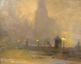
Manierre Dawson (1887-1969)


An uncharacteristic nocturne
by Chicago's most famous
abstract modernist.

(painted on a roofing shingle)

Reminds me of an urban background
from the Quattrocento


Richard Schmid (1934-)


And here's a typical nocturne
from Chicago's most famous living Romantic
(and former president
of the Palette and Chisel)


Bo Bartlett

There always something
mischievous from this painter,
who's been in every Art Chicago
of this decade.


Bo Bartlett


and here's his self portrait
as Harry Potter.


Javier Marin (b. 1962)


Here's the most dramatic figurative sculpture
I've yet to see in these shows.

Big - ugly - grotesque.

Yes.

But, wouldn't they look good
in a tropical garden ?


Hugo Robus (1885-1964)
"Dawn"

I wonder if Robus is as popular elsewhere.
He seems to be appearing
regularly in Chicago.


Moses Soyer (1899-1974)


I like the Soyer twins,
and especially this nude from 1945.

Not to get too incestuous here,
but this exactly how I image my mother
must have looked at that time.


Jeremy Long (b. 1971)

I'm becoming a fan of this local painter
who makes enormous paintings
(the above is 6 foot high)


I like the power,
but might have had enough
of his Steven Spielberg vision
of American middle class life.


Ben Tinsley


Who is this guy?

One of my favorite paintings at the show,
selling for about $1600.


Hong Purume

This is the second year
I've stumbled across the
work of this Korean painter.

And a quick search of the internet
reveals that
she is just as beautiful
as her paintings.


Franz Kline 1957

Allegedly,
Franz Kline had no special interest
in the schools of Asian calligraphy.

What a tragedy
that he didn't found his own.

That's the problem with Modernist ideology:

it doesn't give much respect to followers.


China Square Gallery

Here's a Manhattan gallery's take
on contemporary art in China.

(more enjoyable, for me,
than the show currently at the Chicago Cultural Center)


The sculptor (of the nudes) is Cai Zhisong,
the painter is Xu Weixin


but here's the kind of Chinese sculpture
that I really like.

So little can say so much.

(very considerate of Art Chicago
to include a gallery of ancient Chinese art)

**********

Note:
this year marked the return
of Arcadia Gallery
but I wasn't really thrilled
because
by now, I've already seen Jeremy Lipking,
and the paintings they brought this time were
a bit disappointing.


<