Gates of Paradise

Hallelujah !
Ghiberti's "Gates of Paradise"
made it to Chicago
(or... at least 3 panels will be on display
here until October14th)

First - to dispense with the complaints department:
2. Reproductions of these doors used to be, and still should be, on permanent display at the Chicago museum - just as they are today on the wall where the originals used to hang.
(because there is no way that photographs can do justice -- to even the areas in lowest relief)

But complaints aside -- wow !
what a sculptural project.
Did it really take Ghiberti,
and a crew that included Donatello and Uccello,
20 years to complete this project ?
When you consider both the power and the detail of
the design -- yes I can believe it.
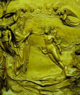
(above is my favorite panel from the show, "Genesis")

Contrarian that he is,
my father
insists that the worst sculptor
won the contest for the Baptistery doors
(he says Ghiberti is "too fussy"
and he's a big fan of
the more macho Della Quercia -
and looking at this piece , I could almost agree
(it always sends shivers down my spine)
But please !
let's give Lorenzo a break -
it was a far different sculptor who made these doors
from the one who won the contest.
(above is a second panel from the show, "David")
 One of the big issues
that's worried me ...
is what is the proper angle from which
each panel should be viewed.
"Genesis" originally was way at the top, 8-10 feet up on wall
while "David" would have been somewhere around the knees.
In the Chicago exhibit -- they're all hung at eye level
and after visiting them about 6 times so far,
I've finally concluded that was the best plan,
since my choice of an ideal viewpoint,
for ALL three,
is about a foot lower than my eyes
(and I'm six foot)
(and come to think of it ...
that's smack in the center of each panel ,
and would correspond to the vanishing point on the above scene)
So .. I really don't think Lorenzo was planning for
the angle of sight
that would be available
when the panels got hung up on the door.
The doors seem to compose well with each other
in their current positions,
but I think the viewer was meant to kneel to see the bottom panels,
and stand up on a chair to see the top ones.
(above is the third panel now in Chicago, "Isaac")

But getting around to the details ---
(which is why this exhibit is so special)
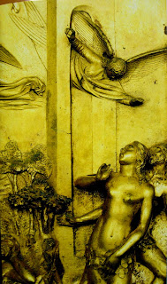
Here's Eve from the "Genesis" panel.
And.. I'm afraid I'm starting to have a problem with it --
not just this detail,
but all of the areas in high-relief,
like this figure of Eve.
The full-round figures just don't satisfy me
anywhere near the pleasure I get
from the design as a whole.
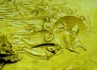
(a design that gives such a wonderful impact
to that angel flying through the original
"gates of Paradise"

What I noticed about Adam in the Creation,
on this, my sixth visit,
is that he's so pathetic.

Here, he's a like a drunk being helped up from the pavement,
and in the previous scene,
he's shown hiding behind Eve,
as the angel drives them out of the Garden

Eve, on the hand, is transcendent,
here -- as she rises up from the sleeping Adam

..and here as she protects
her helpless mate.
Was Ghiberti a mama's boy ?
Look again at the entire scene:

Woman is the crown of creation.

On my first few trips,
it was little, low relief details like this

..and this
that really charmed me
(and I've always liked angels)
But this time,
I think it's over-all drama,
and sense of pictorial space
that were really his specialty.
(maybe he should have been a painter)
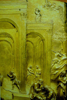
 Moving on to the story of Jacob & Esau,
I admit to being a little confused
by all this court trickery.
But I guess Isaac was confused too,
so the feeling is appropriate.

What are those figures doing in the background ?
Mischief is afoot - and I don't like it

A collection of unbalanced fools and
scheming cheats,
how unpleasant !


Elegance and treachery.
(Machiavelli lived about a century later)
(I think the boys in the background
are Esau selling his birthright to Jacob
for a mess of porridge)

I fail to see the purpose for these figures on the left,
other than to make a visual design
with the rest of the panel and doors
or, perhaps, to give that feeling of conspiracy,
as they whisper together
backs to the audience
(note: my friend Misha has given me a more positive,rabbinical interpretation:
God knows that Esau, poor boy, is unfit to transfer the Jewish tradition
(he had already sold his birthright for a meal)
so God, Isaac, Jacob, and Rebeccah are all in on the scheme


And finally, moving on to my favorite,
the story of David and Goliath

It's not really that the overall design
stands out among the others,
but the details on the figures
seem to have been done by someone
better than whoever finished up the other two.
Wherever the eyes closes in on a detail,
it is well rewarded !
There's just an incredible intensity about
the areas in low relief.

like this plane of receding soldiers.
(the photo really is not doing it justice)
 and this wonderful little scene
that appears in the distance,
the entrance into Jerusalem
carrying the head of Goliath.
It's like a world within a world,
and the energy
never
slackens


every little head in the background,
perfect - with its own expression
*************************
(below is the Han Dynasty figure from the Met
to which Lori referred in her comment)


