Plein air painters of chicago 2006
And I especially like the ones done in winter -- as I imagine the blue fingers of the painter standing in the snow (just as I enjoy reading stories of arctic exploration -- while comfortably seated in a warm library)
I've severely cropped many of the following pictures for two reasons: first -- because I want to show detail, but can't download large files onto blogger -- second --because in many cases, the detail is what I like the most.


These two are by Scott Tallman -- the leader of the group -- and I think you can see why. In one -- I really feel the cold wind coming off that lake -- and in the other -- these are the streets of eternal Chicago -- where so many of us (including myself) have arrived with only a suitcase.
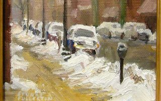
This was done by my friend, the lawman, Stuart Fullerton -- who applies his strict sense of order to the chaotic mess of urban life (especially chaotic after heavy snows). The subject of this painting is "Felicitous Opportunity" -- which is exactly what an empty (and snow cleared) parking space is in the city. (but the title is "Milwaukee Avenue")
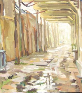
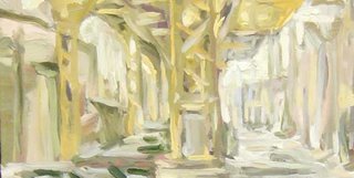
The above two are by Ted Leeming -- and I think I'm becoming a fan of his slurpy-but organized style of painting space -- and space is the subject of these paintings -- not "New Year's Day 2006" or "Cougle Poultry, Fulton Market". I just love how his loose but carefully considered strokes carry me deep into the picture plane -- and aestheticize what would usually be experienced as urban dreariness.
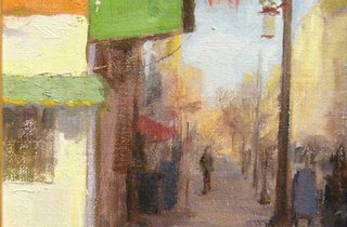
I'm also a fan of Marci Oleszkiewicz -- a young painter who first arrived at the Palette and Chisel as the winner of my first-and-last drawing competition for high school students. She is so gifted with that mysterious sense of putting things together in attractive ways -- and though I cropped the above painting to enjoy its up-close details --- of all the paintings here shown, her paintings most command attention accross a room.
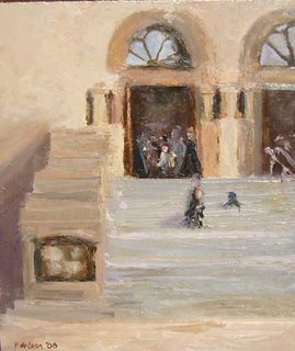
Here's one whose shallow stage did not allow for cropping -- and it feels Latin, doesn't it ? -- just like the visuality of Latin television stations stands out as different from all the others -- maybe it's the love for a kind of monumentality and warm color. (the artist is Pablo De Leon, the title is "After Mass")


