Two Sung Calligraphers
(note: this is becoming one of the endless posts that I never finish -- as I keep adding details -- and MORE CALLIGRAPHERS from the National Palace exhibit and blather away about them -- and that does seem to be the difference (for me) between scrolls of calligraphy and all the other kinds of painting: there's just an endless fascination in detail)
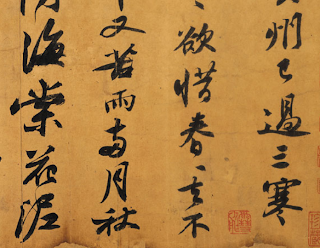
 Huang T'ing-chien (1045-1105)- Poetry of Han-Shan and Layman P'ang
 Hui-tsung (1082-1135)- Poetry
That most wise and itinerant scholar, Sir Gawain, has scheduled a trip to Tai-Pei to coincide with the rotation of exhibits at the National Palace Museum -- which proclaims that "Currently, works of Northern Sung painting and calligraphy are extremely rare, so the chance to see such a rich and complete display of works from this crucial period in Chinese art history all at the same time is truly a once-in-a-lifetime event"
Here is Sir. G's first report to the blogging community of this event, and it is to be hoped that many more will follow.
Here is a site with full pictures of items on display -- but just in case these pictures are removed when the exhibit closes -- I'm showing details from two of Sir G's favorites.

There's a child-like quality to Huang T'ing-chien -- carefree -- spontaneous -- but - of course -- not child-like at all -- since there is perfect balance and control -- and there's that thrill of walking the edge between form and formless.

..and also that explosive, enthusiastic playfulness of children -- jumping around just because it feels good.

In Hui-tsung, I still feel the child-at-play -- but now the child has moved into a ballet class -- with all of its formal elegance -- but losing none of its explosive enthusiasm.

Isn't this the essence of refinement ? Yes, I really like Emperor Hui-tsung -- that poor devil who, as 13th son, never expected to become emperor -- and ended up as prisoner of the invading Jurgens.
But ....to continue my ongoing dispute with Sir G. ... I also liked Xugu --- where the characters, like this one seem to be immersed in space rather than floating on a surface.

What gets me here is the progression -- as if the two figures on the right were an expanded - and whackified - variant of the action on the left.


 Huang T'ing-chien (1045-1105)- Poetry of Han-Shan and Layman P'ang
 Hui-tsung (1082-1135)- Poetry
 That most wise and itinerant scholar, Sir Gawain, has scheduled a trip to Tai-Pei to coincide with the rotation of exhibits at the National Palace Museum -- which proclaims that "Currently, works of Northern Sung painting and calligraphy are extremely rare, so the chance to see such a rich and complete display of works from this crucial period in Chinese art history all at the same time is truly a once-in-a-lifetime event"
Here is Sir. G's first report to the blogging community of this event, and it is to be hoped that many more will follow.
Here is a site with full pictures of items on display -- but just in case these pictures are removed when the exhibit closes -- I'm showing details from two of Sir G's favorites.

There's a child-like quality to Huang T'ing-chien -- carefree -- spontaneous -- but - of course -- not child-like at all -- since there is perfect balance and control -- and there's that thrill of walking the edge between form and formless.

..and also that explosive, enthusiastic playfulness of children -- jumping around just because it feels good.

In Hui-tsung, I still feel the child-at-play -- but now the child has moved into a ballet class -- with all of its formal elegance -- but losing none of its explosive enthusiasm.

Isn't this the essence of refinement ? Yes, I really like Emperor Hui-tsung -- that poor devil who, as 13th son, never expected to become emperor -- and ended up as prisoner of the invading Jurgens.
But ....to continue my ongoing dispute with Sir G. ... I also liked Xugu --- where the characters, like this one seem to be immersed in space rather than floating on a surface.
**** and here begins the parade of details ***

What gets me here is the progression -- as if the two figures on the right were an expanded - and whackified - variant of the action on the left.

And look at these two figures ! -- what a different mood accompanies that heavy - expressive -- almost angry character on the right -- while the one to the left is so suave -- genteel -- balanced

What gets me here is precise drawing of the white shapes (i.e. the paper between the strokes) --
as well as squiggly hair-thin lines -- just where they're needed !
as well as squiggly hair-thin lines -- just where they're needed !

Chinese-illiterate person that I am -- I have no idea what these characters are supposed to suggest -- but to me -- so many of them -- like this one -- suggests a human body in action -- dancing or even fighting -- and what a happy dancer this ! (again noting the precision of the white shapes trapped between the lines)

What a spectacular progression from top to bottom here ! Opening up -- dancing -- throwing itself into space with wild abandon (but always with balance) -- while that top character does so much with so little -- it's only one squiggly line !

And talk about doing much with little ! -- look at that movement -- what a fine arrangement of white shapes -- and how carefully done is that thin sliver on the right. It's the same precision that we Euros who draw live models must use when making the lines around the eye lids.

More wanton joy combined with exact precision (and this would make a fine pattern for one of Gawain's handkerchiefs, don't you think ?)

This one just seems to remind me of the underhanded pitch in softball (or cricket for you, Robert)

Moving on to Emperor Hui-tsung -- it does seem we've gone from earth to sky -- or maybe another planet or galaxy -- these things are so intense and strange. The sharp, pointed tips seem to emphasize the ink over the paper behind -- like vapor trails left by airplanes (or spaceships) in the sky.

And this is where I believe he really was emperor -- at the center of a vast, complex social network - a life of continuous (often unforeseen) demands demanding continuous balance. The poor guy was a Taoist master, he should have been living in a cave, not a palace.

He feels kind of trapped here, doesn't he ?

To my eye, usually the characters on this scroll relate vertically -- but here's a horizontal pair that seems like a ballet for four elegant dancers. The emperor seems to live in a world of sharp angles and long sleeves.

But in this vertical arrangement -- he just seems to be in his own room -- having a good time with his imagination -- or perhaps with memories of the home planet.
 NYR is especially fond of Su Shih (1036-1101) whose famous poem/calligraphy "Cold Food Observance" is also in the current TaiPei exhibit.

He's different from the other two, isn't he ? He seems earthier -- gutsier -- characters pull inward instead of belonging to the space around them -- and they seem to only relate to each other in the vertical (not horizontal) lines.
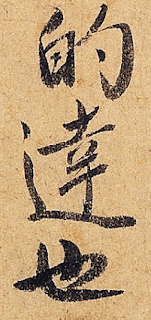
 Here's a character that could have come from nobody else --- and like Xugu -- he works with heavy brush- light brush. According to the Palace website, Huang T'ing Chien referred to this kind of Su Shih character as "toads flattened by rocks"

I like these heavy set characters -- they remind me of Jackie Gleason dancing
 And what a florid variety of feeling -- like a crowd of fans sitting in the bleachers at the ball game

This one is sooooo sharp. Su Shih wrote that Huang T'ing Chien 's were so long and narrow that they resembled "trees hanging with snakes" -- and yet -- I think the pot was calling the kettle black.
 This contrast of fat and thin is very exciting -- it's like a run in a violin solo - or like a Jackson Pollack drip painting -- if only Pollack could draw with drips.

More drama and passion -- these are characters that could accompany historical dramas like "Three Kingdoms" - or the civil wars of the 20th C.

According to Huang T'ing chien, Su Shih did not excel at suspending the wrist, so his range was limited. The right portions of the characters do not expand freely, so the diagonal strokes to the lower right are easily flawed, creating a "left elegant, right withered" appearance. -- and yet that doesn't always seem to be the case. (I get the feeling these two were rivals)

 so aggressive -- so assertive -- this is a man who has tried to make things happen

I love these shaky legs ! -- I think in martial arts, this is called "drunken form"
 something feels very difficult about this arrangement - with everything going in different directions

 Back to children having fun -- doesn't anyone ever stop wanting to be a child ?
......................................................................
Moving on to another Sung Dynasty artist, HSUEH SHAO-P'ENG -- who is also known as the:
RECLUSE OF VERDANT ABSTRUSENESS
(it's enough just to deserve that name -- much less to make anything famous)

What an incredible variety of styles -- all on the same page!

and yet none of them could be done by the previous three gentlemen shown on this post.
These characters almost feel Arabic -- as letters that are revealing divine mysteries.
 Here, it's as if he's trying to make an ugly, jumbled train-wreck of a letter -- but he just can't escape his innate love of elegance.

Like Su Shih, his characters seem self-absorbed -- not interested in relating to their neighbors in their columns or rows -- just independent crystallizations of energy -- like a display of exotic, tropical bugs.
 If any language could the secrets of inner body-spirit development --
this would be the alphabet used.
 Like the channels of human inner anatomy -- so full of bizarre twists and turns --
but in coordination -- so capable of powerful expression.
 Four ways of being breathtaking
(if I were to order a suit of armor -- the one in the lower-right corner
would be engraved on my shield)

Or .. maybe these are directions to places in the hilly Ozarks -- with twisty, branching dirt roads (or are they rocky stream beds ?) -- that eventually lead the frustrated traveler to conclude:
"you just can't get there from here"
 This is how I make an argument.
I meander around, stretch out into a long soliloquy, and finally I get to the point!

I think this is in response to a challenge:
Make a form -- make a wackier version of it -- and make them both as one.

Have any three dots ever expressed so much purpose ?

All of these should be embroidered on some of Marly's funny hats.
 I have the terrible feeling that if the "recluse of verdant abstruseness" went to school ...
he was thrown out for continuous daydreaming in class.
 and he feels the most 20th century of these guys (Juan Miro) --
with the willful pursuit of absurdity

 And yet here's a completely different page attached to the same scroll -
where perhaps the meaning of the text has finally trumped the playfulness of his brush.

Moving on to a more conservative academic, Mi Fu (1051-1107) -- here's his "Poem written on the Wu River" -- borrowed by the National Palace, apparently, from the Crawford collection at the Met. (guess it's time for me to visit NY again)
What's the difference between the above squibbles and what little Johnny might do in fingerpainting class ? I think that would be a good question to ask applicants for the job of museum curator. Put the above arrangement into a portfolio of children's work -- and ask them to identify the Sung calligrapher.

And, of course, Mi Fu hardly appears to be more conservative than the others -- despite his complaints about the "wild cursive script" and lack of "tracks of standards" of Chang Hsu .
How could he have been any wilder ?
The above reminds me of the fireworks show every July 4th above the football field of our local high school. I can almost hear those ink strokes banging and whistling.
It's what I'd call "Joy in Life"

Each of these characters is so well designed -- they could each be corporate logos -- for inter-galactic trading firms.
And here --center bottom-- is the first instance I've seen of character collapse -- or maybe it's more like a bud that hasn't fully opened into the flower.
 And sometimes the calligrapher seems to be saying:
"I'm doing this -- just because I can"
But note that however intense/bizarre each character is --- the space between them still feels open and fresh -- i.e. it hasn't been ignored.
 But the artist has made it a bit easier on himself: since he's only putting one --or two -- characters between the horizontal boundaries of the scroll.
 It always seems to be party time in Mi Fu's world.
 Not much sense of seriousness here
 Lots of laughter -- lots of clever joking -- don't they know what the nomadic peoples of central Asia have in store for them ?
 It's like a party -- full of different kinds of people -- all of them interesting - and I especially like the lady who's bottom-row-center-right ---- the one who keeping four balls in the air.
 As my minimal knowledge of history recalls -- after the Buddhist years of the Tang Dynasty, this was a period of Taoist ascendancy -- and there's no way these merry goof-balls should be running government ministries.
 Now, we're getting a sense of color (heavy ink versus light ink).
It's all too delicious.
 Lower right corner is me -- bicycling to my shop every afternoon
(to its left -- is me -- lifting bicycle over the curb)
 Let's face it -- a lot of life is not that much fun --
but here we have a perpetual children's birthday party -- on demand -- whenever you want it --
the clowns arrive and start twisting their funny balloons.

Here's another Mi Fu -- feeling a bit more serious -- and reminding us that these masters could be quite versatile

What a gutsy - swinging confection. I think it's the sense of balance that makes it so easy for me to imagine these as people -- in this case, a dancer at some kind of folk festival.
The big red, intrusive seal, by the way, comes from the 18th C. Qianlong emperor -- who seems to have been so fond of leaving his mark on the masterpieces of Chinese culture.
Megalomaniac ? You bet --- but a very wise one -- i.e. the placement here really serves the character well -- making it seem to jumping forward from the picture plane

If these are people -- they're the kind you'd find in the fish market, not at court.
And what about those small splotches that surround it ? Are those intentional ? They seem to help it -- so even if I had the opportunity, I wouldn't take them out.

What a precarious balance ! Where the bottom two characters need the one on top to stay in balance. (I can't remember seeing such inter-dependence ever before)

I can imagine these letters flashing across the screen at the very beginning of a martial arts epic (but not the cheesy kind -- something more like "Seven Samurai")

I love to see tall, beautiful women dancing -- where their long, lanky limbs are like architectural features on the stage.

This is a fight scene -- like one of those epic duels in "Water Margins" where two equally matched opponents battle each other for dozens of rounds.

I love the contrasts in these strokes -- there's only one that swells (lower left)-- and that really sets the character of the whole piece.
 My wife and I on the dance floor ?
There's such a contrast in energy and personality

Have you noticed a different mood ? Well, this is a different artist, Ts'ai Hsiang (1012-1067)-- and this is his "Leaving the City" letter of 1055 -- said to reflect his sorrow at the death of his 18 year old son the same year.
 Some characters seem like short, stifled sobs
 and sometimes he's letting it all out in flowing tears and wails.
According to his fellow calligrapher, Mi Fu:
"like a youthful girl, the forms and bearing are seductively charming and the movement slow and languorous, with plenty of ornamentation and complex beauty"
 But with what extraordinary delicacy -- these are so close to being playful.
The National Palace website described him as follows:
"the generous spacing of the character structure and the hook method of Yen Chen-ch'ing conform to Ko Li-fang's statement:
"Chun-mo first studied the calligraphy of Chou Yueh, the variation of his forms departing from that of Yen P'ing yuan(Chen Ch'ing)
 But still they're very painful ,
as if he's clutching his heart
 one of the those characters that seems to be
going every direction at once
 Things (hopes ?) are melting -- and settling
to the bottom.
 What a delicious character !
it feels three dimensional.
And is that a tear -- hanging -- suspended-- in space ?
 I love where that whipping line gets so thin,
it momentarily fades away
 This reminds of the train wreck I saw,
just a few hundred feet from my shop,
where the cars were just a few inches too tall
to fit beneath the overpass
 Each of these characters feel so compact,
self contained
facing inward
and angry

And these just feel lost,
perfectly composed,
but lost

one jerking sob fades away,
then it's followed by another
 ******************************************************
Now we move on to another scroll by the same artist,
this one is called the "T'ao Sheng" letter,
and things are becoming much more light hearted.
"The maturity in cursive script methods and flow of brush movement indeed conform to what Ts'ai Hsiang himself once wrote:
"I have attained the 'roof-leak' method of Su Ts'ai-weng (shun-yuan)"

"The structure of these few characters and the brush method both bear the manner associate with draft cursive script, which is somewhat unique in northern Sung calligraphy." (National Palace Museum)
I haven't seen anything quite this minimal before -- but I'm not sure you could call it simple
..the balance depending so heavily on the brush running short on ink.
 This is almost feeling more like a close-up drawing of vines and leaves
 These sharp tips feel so quirky
and temporary - as if it will dissolve in a second
 what an amazing sequence,
making space for that over-heavy stroke
 This sure feels like foreground to background,
with a squiggle in the middle

"In the Sung dynasty appeared a new kind of brush - "Brush of Leisurely Eminence", which had a long tip and was solidly round. It also suffered less from the problem of the tip splitting apart and hairs falling out. Its ability to retain ink was far greater than the jujube-center brush of the Hari and Chin period. When doing calligraphy, its movement was fluid and flowing as well as natural and easy." (National Palace Website)
 The "Brush of Leisurely Eminence" again at work !

 What funny little splotches
..but they're not just splotches
(was this a game ?: make a mark that looks like a careless splotch
.. but effectively organizes its surrounding space)
 This could be a painting all by itself
(three birds on a tree ?)
 This one reminds me of the threads painted by Vermeer
..and, of course, when the tiny thread spools into just the right place
.. it feels so, so good
 ******************************************************
This is the "Ch'eng Hsin Hall" letter (also by Ts'ai Hsiang)
To quote the commentary from the National Palace website:
"This type of paper originated in the Southern T'ang of the Five Dynasties period. Emperor Lieh-tsu, the founder Li Sheng (888-943), ordered paper manufacturers in Hsuan-ch-eng to produce it. The Ch'eng-hsin Hall was the name of the residence where Lieh-tsu administered Nanking. According to descriptions of this paper, its surface was thin and smooth as the membrane of an egg, while tough and resilient as jade, having a fine and thin quality as well as a glossy shine."
 It's not happy --- it's not sad -- but it is eccentric -- maybe you'd call it...
Fire energy ? The dance of splotches and squiggles ?
It certainly feels very comfortable,
and that figure at the bottom is unlike any other I've yet seen
Here's more from the National Palace:
"Ou-yang Hsiu once critiqued Ts'ai Hsiang's calligraphy as "refined yet vigorous," referring to the precision and sharpness of his brushwork."
 That stroke within the box (in the middle character) -- how'd he do that ?
(not much margin for error)
These strokes remind me of the timbers in old, falling-down barns...
they're weathered -- and somewhat askew
The National Palace wrote:
"The grace and beauty of the right-falling strokes and the elongated character forms are as Huang T'ing-chien once wrote: "Chun-mo's semi-standard script letters are exceptionally graceful and beautiful, able to enter the house of Yung-hsing (Yu Shih-nan)"
 Reminding me of my first experience with calligraphy
(the mark of Zorro slashed across the waistcoat of Sgt. Garcia)
 Here's the National Palace commentary on this character:
"The hook method is simiar to that of Yen Chien-ch'ing. As Ko Li-fang once wrote, "Chun-mo first studied the calligraphy of Chou Yueh, the variation of his forms departing from tht of Yen P'ing-yuan (Chen-ch'ing)"
 Looks like something cut in the sand -- maybe the body of a crab ?
and then seen a few days later

 Reminds me of the Sulka masks (New Guinea)
 So many different ways to balance things -
the heavy stroke on the right versus
the broken, cantilevered dollop on the left
 **********************
Hsu Hsuan (916-991)
Letter: "Personal Sincerity"
I think we've just entered a much different world --
Hsu Hsuan grew up at the end of the Tang Dynasty

The National Palace Website wrote:
"In general, the brushwork is full and rounded - reflecting the period style of plump beatuy followed in the late T'ang dynasty. This same manner can also be found in the hearly Sung calligrapher Li Chien-Chung"
Huang T'ing-chien wrote that "the brush of the Great Official (Hsu Hsuan) is solid and the strokes powerful, just like the presentation in his writing."

"Record of Collected Antiquities" by Ou-yang Hsiu mentions that "Scholars all call the brush of Hsuan as imprecise, but studied in the characters. Each dot and stroke has its method"
The National Palace website adds:
"The brush in this piece of calligraphy seems to move more at will.
In terms of detail, the brushwork is not extremely fastidious, but the brush movement in the characters as a whole has a method that is naturally fluid."
OK ... but .... I'd like to see an example of "fastidious",
since, to me, this work seems oh-so-sharp

These feel both whimsical.... and classic
(something about the stately proportions of the spaces)
 And for whatever reason...
these remind me of the quick brush drawings of Rembrandt
.. are they feeling solemn and mysterious ?

What a fine sequence -
and how delicately a stroke is either stiff or going limp

This one reminds me of a drop of pond water ...
seen through a micrscope...
with every kind of miniature critter
busily leading it critter life


Huang Ting Chien (1045-1105) presented these three poems to Chao Ching-tao (who admired his calligraphy).
This letter discusses the calligraphy of Su Shih and judges him
"first under heaven"--and advised him to use Su Shih as a model instead of
himslef -- which would only lead to "a flaccid brulsh iwth no spirit or energy"


Moving on to Emperor Hui-tsung -- it does seem we've gone from earth to sky -- or maybe another planet or galaxy -- these things are so intense and strange. The sharp, pointed tips seem to emphasize the ink over the paper behind -- like vapor trails left by airplanes (or spaceships) in the sky.

And this is where I believe he really was emperor -- at the center of a vast, complex social network - a life of continuous (often unforeseen) demands demanding continuous balance. The poor guy was a Taoist master, he should have been living in a cave, not a palace.

He feels kind of trapped here, doesn't he ?

To my eye, usually the characters on this scroll relate vertically -- but here's a horizontal pair that seems like a ballet for four elegant dancers. The emperor seems to live in a world of sharp angles and long sleeves.

But in this vertical arrangement -- he just seems to be in his own room -- having a good time with his imagination -- or perhaps with memories of the home planet.
 NYR is especially fond of Su Shih (1036-1101) whose famous poem/calligraphy "Cold Food Observance" is also in the current TaiPei exhibit.
He's different from the other two, isn't he ? He seems earthier -- gutsier -- characters pull inward instead of belonging to the space around them -- and they seem to only relate to each other in the vertical (not horizontal) lines.
 Here's a character that could have come from nobody else --- and like Xugu -- he works with heavy brush- light brush. According to the Palace website, Huang T'ing Chien referred to this kind of Su Shih character as "toads flattened by rocks"
I like these heavy set characters -- they remind me of Jackie Gleason dancing
 And what a florid variety of feeling -- like a crowd of fans sitting in the bleachers at the ball game
This one is sooooo sharp. Su Shih wrote that Huang T'ing Chien 's were so long and narrow that they resembled "trees hanging with snakes" -- and yet -- I think the pot was calling the kettle black.

 This contrast of fat and thin is very exciting -- it's like a run in a violin solo - or like a Jackson Pollack drip painting -- if only Pollack could draw with drips.
More drama and passion -- these are characters that could accompany historical dramas like "Three Kingdoms" - or the civil wars of the 20th C.

According to Huang T'ing chien, Su Shih did not excel at suspending the wrist, so his range was limited. The right portions of the characters do not expand freely, so the diagonal strokes to the lower right are easily flawed, creating a "left elegant, right withered" appearance. -- and yet that doesn't always seem to be the case. (I get the feeling these two were rivals)

 so aggressive -- so assertive -- this is a man who has tried to make things happen
I love these shaky legs ! -- I think in martial arts, this is called "drunken form"
 something feels very difficult about this arrangement - with everything going in different directions
 Back to children having fun -- doesn't anyone ever stop wanting to be a child ?
......................................................................
Moving on to another Sung Dynasty artist, HSUEH SHAO-P'ENG -- who is also known as the:
RECLUSE OF VERDANT ABSTRUSENESS
(it's enough just to deserve that name -- much less to make anything famous)

What an incredible variety of styles -- all on the same page!

and yet none of them could be done by the previous three gentlemen shown on this post.
These characters almost feel Arabic -- as letters that are revealing divine mysteries.
 Here, it's as if he's trying to make an ugly, jumbled train-wreck of a letter -- but he just can't escape his innate love of elegance.
Like Su Shih, his characters seem self-absorbed -- not interested in relating to their neighbors in their columns or rows -- just independent crystallizations of energy -- like a display of exotic, tropical bugs.
 If any language could the secrets of inner body-spirit development --
this would be the alphabet used.
 Like the channels of human inner anatomy -- so full of bizarre twists and turns --
but in coordination -- so capable of powerful expression.
 Four ways of being breathtaking
(if I were to order a suit of armor -- the one in the lower-right corner
would be engraved on my shield)

Or .. maybe these are directions to places in the hilly Ozarks -- with twisty, branching dirt roads (or are they rocky stream beds ?) -- that eventually lead the frustrated traveler to conclude:
"you just can't get there from here"
 This is how I make an argument.
I meander around, stretch out into a long soliloquy, and finally I get to the point!

I think this is in response to a challenge:
Make a form -- make a wackier version of it -- and make them both as one.

Have any three dots ever expressed so much purpose ?

All of these should be embroidered on some of Marly's funny hats.
 I have the terrible feeling that if the "recluse of verdant abstruseness" went to school ...
he was thrown out for continuous daydreaming in class.
 and he feels the most 20th century of these guys (Juan Miro) --
with the willful pursuit of absurdity

 And yet here's a completely different page attached to the same scroll -
where perhaps the meaning of the text has finally trumped the playfulness of his brush.

Moving on to a more conservative academic, Mi Fu (1051-1107) -- here's his "Poem written on the Wu River" -- borrowed by the National Palace, apparently, from the Crawford collection at the Met. (guess it's time for me to visit NY again)
What's the difference between the above squibbles and what little Johnny might do in fingerpainting class ? I think that would be a good question to ask applicants for the job of museum curator. Put the above arrangement into a portfolio of children's work -- and ask them to identify the Sung calligrapher.

And, of course, Mi Fu hardly appears to be more conservative than the others -- despite his complaints about the "wild cursive script" and lack of "tracks of standards" of Chang Hsu .
How could he have been any wilder ?
The above reminds me of the fireworks show every July 4th above the football field of our local high school. I can almost hear those ink strokes banging and whistling.
It's what I'd call "Joy in Life"

Each of these characters is so well designed -- they could each be corporate logos -- for inter-galactic trading firms.
And here --center bottom-- is the first instance I've seen of character collapse -- or maybe it's more like a bud that hasn't fully opened into the flower.
 And sometimes the calligrapher seems to be saying:
"I'm doing this -- just because I can"
But note that however intense/bizarre each character is --- the space between them still feels open and fresh -- i.e. it hasn't been ignored.
 But the artist has made it a bit easier on himself: since he's only putting one --or two -- characters between the horizontal boundaries of the scroll.
 It always seems to be party time in Mi Fu's world.
 Not much sense of seriousness here
 Lots of laughter -- lots of clever joking -- don't they know what the nomadic peoples of central Asia have in store for them ?
 It's like a party -- full of different kinds of people -- all of them interesting - and I especially like the lady who's bottom-row-center-right ---- the one who keeping four balls in the air.
 As my minimal knowledge of history recalls -- after the Buddhist years of the Tang Dynasty, this was a period of Taoist ascendancy -- and there's no way these merry goof-balls should be running government ministries.
 Now, we're getting a sense of color (heavy ink versus light ink).
It's all too delicious.
 Lower right corner is me -- bicycling to my shop every afternoon
(to its left -- is me -- lifting bicycle over the curb)
 Let's face it -- a lot of life is not that much fun --
but here we have a perpetual children's birthday party -- on demand -- whenever you want it --
the clowns arrive and start twisting their funny balloons.

Here's another Mi Fu -- feeling a bit more serious -- and reminding us that these masters could be quite versatile

What a gutsy - swinging confection. I think it's the sense of balance that makes it so easy for me to imagine these as people -- in this case, a dancer at some kind of folk festival.
The big red, intrusive seal, by the way, comes from the 18th C. Qianlong emperor -- who seems to have been so fond of leaving his mark on the masterpieces of Chinese culture.
Megalomaniac ? You bet --- but a very wise one -- i.e. the placement here really serves the character well -- making it seem to jumping forward from the picture plane

If these are people -- they're the kind you'd find in the fish market, not at court.
And what about those small splotches that surround it ? Are those intentional ? They seem to help it -- so even if I had the opportunity, I wouldn't take them out.

What a precarious balance ! Where the bottom two characters need the one on top to stay in balance. (I can't remember seeing such inter-dependence ever before)

I can imagine these letters flashing across the screen at the very beginning of a martial arts epic (but not the cheesy kind -- something more like "Seven Samurai")

I love to see tall, beautiful women dancing -- where their long, lanky limbs are like architectural features on the stage.

This is a fight scene -- like one of those epic duels in "Water Margins" where two equally matched opponents battle each other for dozens of rounds.

I love the contrasts in these strokes -- there's only one that swells (lower left)-- and that really sets the character of the whole piece.
 My wife and I on the dance floor ?
There's such a contrast in energy and personality

Have you noticed a different mood ? Well, this is a different artist, Ts'ai Hsiang (1012-1067)-- and this is his "Leaving the City" letter of 1055 -- said to reflect his sorrow at the death of his 18 year old son the same year.
 Some characters seem like short, stifled sobs
 and sometimes he's letting it all out in flowing tears and wails.
According to his fellow calligrapher, Mi Fu:
"like a youthful girl, the forms and bearing are seductively charming and the movement slow and languorous, with plenty of ornamentation and complex beauty"
 But with what extraordinary delicacy -- these are so close to being playful.
The National Palace website described him as follows:
"the generous spacing of the character structure and the hook method of Yen Chen-ch'ing conform to Ko Li-fang's statement:
"Chun-mo first studied the calligraphy of Chou Yueh, the variation of his forms departing from that of Yen P'ing yuan(Chen Ch'ing)
 But still they're very painful ,
as if he's clutching his heart
 one of the those characters that seems to be
going every direction at once
 Things (hopes ?) are melting -- and settling
to the bottom.
 What a delicious character !
it feels three dimensional.
And is that a tear -- hanging -- suspended-- in space ?
 I love where that whipping line gets so thin,
it momentarily fades away
 This reminds of the train wreck I saw,
just a few hundred feet from my shop,
where the cars were just a few inches too tall
to fit beneath the overpass
 Each of these characters feel so compact,
self contained
facing inward
and angry

And these just feel lost,
perfectly composed,
but lost

one jerking sob fades away,
then it's followed by another
 ******************************************************
Now we move on to another scroll by the same artist,
this one is called the "T'ao Sheng" letter,
and things are becoming much more light hearted.
"The maturity in cursive script methods and flow of brush movement indeed conform to what Ts'ai Hsiang himself once wrote:
"I have attained the 'roof-leak' method of Su Ts'ai-weng (shun-yuan)"

"The structure of these few characters and the brush method both bear the manner associate with draft cursive script, which is somewhat unique in northern Sung calligraphy." (National Palace Museum)
I haven't seen anything quite this minimal before -- but I'm not sure you could call it simple
..the balance depending so heavily on the brush running short on ink.
 This is almost feeling more like a close-up drawing of vines and leaves
 These sharp tips feel so quirky
and temporary - as if it will dissolve in a second
 what an amazing sequence,
making space for that over-heavy stroke
 This sure feels like foreground to background,
with a squiggle in the middle

"In the Sung dynasty appeared a new kind of brush - "Brush of Leisurely Eminence", which had a long tip and was solidly round. It also suffered less from the problem of the tip splitting apart and hairs falling out. Its ability to retain ink was far greater than the jujube-center brush of the Hari and Chin period. When doing calligraphy, its movement was fluid and flowing as well as natural and easy." (National Palace Website)
 The "Brush of Leisurely Eminence" again at work !
 What funny little splotches
..but they're not just splotches
(was this a game ?: make a mark that looks like a careless splotch
.. but effectively organizes its surrounding space)
 This could be a painting all by itself
(three birds on a tree ?)
 This one reminds me of the threads painted by Vermeer
..and, of course, when the tiny thread spools into just the right place
.. it feels so, so good
 ******************************************************
This is the "Ch'eng Hsin Hall" letter (also by Ts'ai Hsiang)
To quote the commentary from the National Palace website:
"This type of paper originated in the Southern T'ang of the Five Dynasties period. Emperor Lieh-tsu, the founder Li Sheng (888-943), ordered paper manufacturers in Hsuan-ch-eng to produce it. The Ch'eng-hsin Hall was the name of the residence where Lieh-tsu administered Nanking. According to descriptions of this paper, its surface was thin and smooth as the membrane of an egg, while tough and resilient as jade, having a fine and thin quality as well as a glossy shine."
 It's not happy --- it's not sad -- but it is eccentric -- maybe you'd call it...
Fire energy ? The dance of splotches and squiggles ?
It certainly feels very comfortable,
and that figure at the bottom is unlike any other I've yet seen
Here's more from the National Palace:
"Ou-yang Hsiu once critiqued Ts'ai Hsiang's calligraphy as "refined yet vigorous," referring to the precision and sharpness of his brushwork."
 That stroke within the box (in the middle character) -- how'd he do that ?
(not much margin for error)
These strokes remind me of the timbers in old, falling-down barns...
they're weathered -- and somewhat askew
The National Palace wrote:
"The grace and beauty of the right-falling strokes and the elongated character forms are as Huang T'ing-chien once wrote: "Chun-mo's semi-standard script letters are exceptionally graceful and beautiful, able to enter the house of Yung-hsing (Yu Shih-nan)"
 Reminding me of my first experience with calligraphy
(the mark of Zorro slashed across the waistcoat of Sgt. Garcia)
 Here's the National Palace commentary on this character:
 "The hook method is simiar to that of Yen Chien-ch'ing. As Ko Li-fang once wrote, "Chun-mo first studied the calligraphy of Chou Yueh, the variation of his forms departing from tht of Yen P'ing-yuan (Chen-ch'ing)"
 Looks like something cut in the sand -- maybe the body of a crab ?
and then seen a few days later

 Reminds me of the Sulka masks (New Guinea)
 So many different ways to balance things -
the heavy stroke on the right versus
the broken, cantilevered dollop on the left
 **********************
Hsu Hsuan (916-991)
Letter: "Personal Sincerity"
I think we've just entered a much different world --
Hsu Hsuan grew up at the end of the Tang Dynasty

The National Palace Website wrote:
"In general, the brushwork is full and rounded - reflecting the period style of plump beatuy followed in the late T'ang dynasty. This same manner can also be found in the hearly Sung calligrapher Li Chien-Chung"
Huang T'ing-chien wrote that "the brush of the Great Official (Hsu Hsuan) is solid and the strokes powerful, just like the presentation in his writing."

"Record of Collected Antiquities" by Ou-yang Hsiu mentions that "Scholars all call the brush of Hsuan as imprecise, but studied in the characters. Each dot and stroke has its method"
The National Palace website adds:
"The brush in this piece of calligraphy seems to move more at will.
In terms of detail, the brushwork is not extremely fastidious, but the brush movement in the characters as a whole has a method that is naturally fluid."
OK ... but .... I'd like to see an example of "fastidious",
since, to me, this work seems oh-so-sharp

These feel both whimsical.... and classic
(something about the stately proportions of the spaces)
 And for whatever reason...
these remind me of the quick brush drawings of Rembrandt
.. are they feeling solemn and mysterious ?

What a fine sequence -
and how delicately a stroke is either stiff or going limp

This one reminds me of a drop of pond water ...
seen through a micrscope...
with every kind of miniature critter
busily leading it critter life


Huang Ting Chien (1045-1105) presented these three poems to Chao Ching-tao (who admired his calligraphy).
This letter discusses the calligraphy of Su Shih and judges him
"first under heaven"--and advised him to use Su Shih as a model instead of
himslef -- which would only lead to "a flaccid brulsh iwth no spirit or energy"


posted by chris miller at 9:42 AM
![]()


19 Comments:
Unfortunately most of the links failed for some reason, will try again later. I did get the page with the hare and the magpies which i would be delighted to hang on my wall!! Thanks to you and Sir G for the "expo".
I always think these look delicious--one's hand wants to try, and dreams of being just so adept. Same thing with Chinese paintings with bamboo leaves and stems. So effortless-looking.
Thanks, Chris! In tandem we may yet do justice to the show! I have a bit on calligraphy coming up later in the week myself. And there will be one more on paintings, and one (or two) on Qing pottery. That was a hell of a museum visit!
Happy St. Val's, Chris--
May somebody generous give you a chorus line of dancing naked ladies to sculpt!
(Little early: much snow on the way...)
That character under which you say that it reminds you of the human body is "ai" or "love". :)
how interesting to read your comments; i will probably incorporate some of these ideas in my upcoming post -- read it all there.
and you are right, i think they do remind us about the human body. in fact, most things do. as amanda says, the curvature of the human body is just like that of fruit. there is a reason why we say that buildings have facades ("faces"); that's how we perceive them -- with the part of the brain whose job is to look at human faces.
keep going with this, i will be back for mroe!
(Does this mean you play cricket with a soft ball Chris? No need to answer that! At least we regained a little of our self esteem against the Australians last week.)
Your interpretation of these forms (characters / letters) is intriguing and one can see your view. The dancer is of course a ballet dancer but I am not sure about a 3D development. It would be a fascinating experiment to do them in both computer graphics and in clay.
Thanks Chris - I really enjoyed this.
"In Hui-tsung, I still feel the child-at-play -- but now the child has moved into a ballet class -- with all of its formal elegance -- but losing none of its explosive enthusiasm."
That comment is a work of art all by itself.
What fun your comments are--your insatiable lust to see new meaning where lack of knowledge denies meaning.
Marly:
Chris is a man after my heart: he is a damned sensualist. I love it. And his comments are just the sort of aesthetics I wish we would do more in the West (instead of the usual socio-politico-economico-theory-of-sings dreariness).
Thankyou, one and all for your comments!
I'm so glad Otto liked my analogy to ballet class. My friend,Robin , gave my art club a photo-op for her little girl who takes class -- and that combination of seriousness and childish goofiness is so endearing.
And, I'm glad the rest of you appreciated my speculations on the possible meanings of it all -- where the speculation is really just an expression of my(sensual) enjoyment. (so there would be no speculation if the images weren't so enjoyable)
But wait -- there are people who speculate on such things, enjoyable or not -- i.e. the people who do handwriting analysis. Are their conclusions accurate ? Maybe -- but hardly testable.
I think I'm doing the same thing -- only I specialize in highly skilled people at their very best moments.
And -- in a way -- I'm joining their society -- because as I read "Tale of Genji", I realize how important calligraphic expression was to relationships among people of a certain class.
Genji's first wife, for example, takes one look at his next wife's weak handwriting, and realizes that she has nothing to fear about losing Genji's affection.
I just read that passage last night.
You're reading Genji again ? Wonderful ! ... then maybe we can exchange Heaventree posts again -- like we did for Sei Shonagon ? (I'm about 3 weeks away from finishing one of the most wonderful trips I've ever taken)
again? oh, no, for i never stopped! it's one if the half a dozen books I cannot stop reading, only take breaks in. my life is something I live in the interstices of these readings, in between the pages, as it were.
i think it's an excellent idea to group-blog again. in fact, I have a Heian-related post coming up later this week, as my Thursday post - about the cultural games at the Heian court. that would be a good moment to do the Genji posts?
PS. in that scene Murasaki observes: "how can a thirteen year old person (the age of the new wife) have such a childish hand?"
Muraski really deserves her own blog -- and I suppose, eventually she'll get one.
Meanwhile - let's blog away on Heaventree about her.
I've just passed through the chapter that Waley has titled "Agemaki" (which everyone else probably calls "chapter 46") - and I'm stunned!
It had seemed that the narrative was running out of steam -- and maybe switched authors -- after Genji had died -- but suddenly it erupted as wonderfully as it's ever been -- seeming to draw on all the narrative that had preceded it.
That scene where Niou and Kozeri wake up next morning and "opened the double doors and stood together watching the river -- where half hidden by heavy autumn mist, a boat laden with timber would trail across the stream leaving a long white track" -- wow !
Japanese upper class courtship from that era was so strange -- just to see a woman outside of her sceen was the modern American equivalent of 'reaching third base'
Now I have read Sir Gawain's calligraphy essay, and I appreciate the two of you even more! What an interesting conjunction of minds.
And I like his comment to me about Western "socio-politico-economico" dreariness in art commentary.
Yes, you two should do something more together.
Regarding Part II (it's not accepting comments, by the by): I love that description of the life married to flowers, parenting crane. And then you end up with bird tracks on snow--surely the feet of his own delicate children.
cranes, that should be!
Sorry, Marly -- Part II was being edited this morning -- just as you were trying to send your comment.
(I'm working feverishly now -- trying to beat the March 25 deadline when the Palace show closes)
Post a Comment
<< Home